B.INGRID OLSON & LAUREN FULTON
Kenneth Josephson, Michigan, 1981. Courtesy the artist and Stephen Daiter Gallery, Chicago.
FLIP THE MEDIUM
Objektiv #18 investigated the practice of exhibiting camera-based art, both from the insti- tutional and artistic perspectives. For the the issue we’ve asked several writers, artists and curators to reflect on the memorable displays – whether in galleries, books, magazines, online or on billboards – that have remained in their minds. Artist B. Ingrid Olson talks with curator Lauren Fulton about exhibition practises.
B. Ingrid Olson I’d like to begin with the project you were working on when we first met. In fall 2015, you came to my studio in preparation for the exhibition Picture Fiction: Kenneth Josephson and Contemporary Photography at the Museum of Contemporary Art Chicago. Can you talk about your introduction to Josephson’s work and what about his approach distinguishes the work from other conceptual photographic work made around the same time?
Lauren Fulton My introduction to Josephson’s photography occurred many years ago, which I think is common for a lot of people—they just don’t realize it, or know who to credit, even people who have lived in Chicago for years. The motifs he invented for image making have become widely popular and completely infiltrate our lives. I only realized my familiarity with them when I was in graduate school and doing research on the MCA’s permanent collection. I could finally put a name to this person, the man who essentially created the selfie! And launched the entire practice of conceptual photography. One thread of the exhibition situated Josephson’s practice within the history of conceptual art rather than that of photography, a medium that was for many decades considered just a tool in service of something greater. He studied photography, but his ideas have always been what is key to his art; his images were crafted in order to convey them, often humorously. His works question the medium itself, exploring how photographs communicate meaning and presenting tensions between reality and illusion. Around 1964, Josephson began the first of his four most well-known series, called Images within Images, which employs a very witty approach and self-reflexive devices. This was at a time when the label photographer was distinct from artist and Josephson’s work was not considered fine art. There are few photo- graphers I can name, beyond Robert Cumming and Duane Michals, who were working in a similar mode at the time. The fact that these photographers identified as such, rather than as artists, could be why they are only now receiving the attention they deserve. In my opinion, Josephson’s work better aligns with conceptual artists working in a variety of media, like Gary Beydler, Ed Ruscha, and William Wegman. The similarities, both formally and conceptually, between Josephson’s Bread Book (1973) and the artist’s books made by Ruscha are wild.
BIO The Bread Book also made me think of Michael Snow's Cover to Cover. I love the idea of those books being a kind of haptic, photographic sculpture. The exhibition in Chicago featured a parallel component highlighting the work of other artists from around 1970 to now. In addition to the relatively broad time range, the type of work included is quite varied for a photography-focused exhibition: artist books, video, and sculpture alongside more traditional photographs. In your research and selection process, what points of contact did you want to highlight between Josephson and the other artists’ work?
LF There are some sculptures (photo objects), videos, and artist books, as you said. Josephson and I have talked about the individuals I mentioned— mostly West Coast guys—and in a few instances there seems to have been some overlap, geographically, and that largely has to do with where they were trained. Some of the other artists included are more directly connected to Josephson, colleagues like Robert Heinecken, or students of his from the School of the Art Institute of Chicago. Then there is a section of work by contemporary artists that furthers the idea that concepts Josephson invented are prevalent in art today, either through direct or indirect influence. This part of the exhibition includes your work. We selected two-dimensional photographs for the show, but there are also some really interesting links between your Plexi-photo sculptures and the ones Josephson made with fabrics, frames, and plastic tubes.
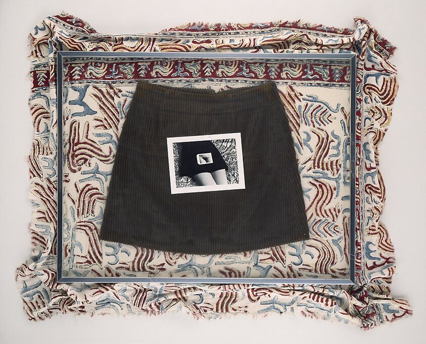
Kenneth Josephson, Sally’s Skirt, 1973.
BIO Sally’s Skirt floored me when I saw it in the exhibition. It is a perfect example of what I see as Josephson’s diversion from a purely conceptual practice. In that piece, there is the primary focal point: a printed photograph of a woman's crotch and legs— that might normally be clothed by the skirt—which is placed on top of an actual skirt. But there is an ex- tra, tangential element: the swath of unhemmed, patterned fabric draped very casually behind the framed skirt and photograph. That decision adds so much itch to the piece, in the best possible way.
LF The tactility and familiarity that these details add is fantastic, like the corduroy skirt or his daughter Anissa’s dress from that time. I think it also emphasizes Josephson’s intervention, his presence, within the work. He often did this by including his outstretched arm or shadow in his photographs, but this construction of layered materials reinforces the “meta” thing he is so known for. How do you think that extra dimension applies to your own work? You, too, have evolved from the two-dimensional into sculpture (both Plexi-photo objects and the reliefs), an approach that supports your ideas of framing the body that were first seen in your more iconic photographs. For the group show we are working on together for the Aspen Art Museum (AAM), you are creating a series of reliefs that will be installed within one of the galleries and function as what you’ve called “punctuations” throughout the space.
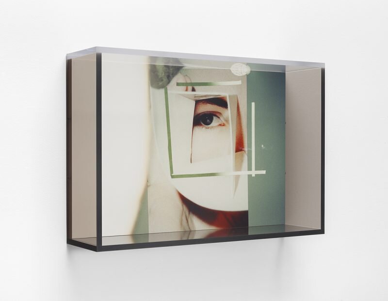
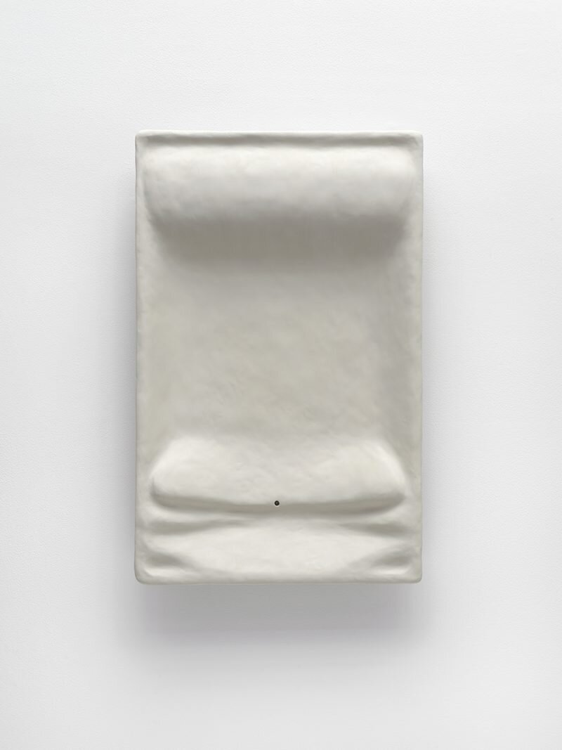
BIO I’ve always been interested in the idea of two-dimensional objects defying flatness and being recognized as material things. My approaches to that question have varied, but always stem from a desire to heighten the bodily awareness of the viewer. In my recent series of Plexiglas Perimeter works, as well as the series of wall-bound relief sculptures, forms and frames demarcate the space that a body can occupy. Both types of work create negative spaces, sitting empty and implying the potential missing positive. The works suggest interaction, or imply a correlation between the viewer’s body and the artwork, and yet the works are not actually meant to be touched. They are vacated spaces, not to be entered. In these works, both photographic and sculptural, the images are still images, but they are contained, structured by a frame and installed at specific heights that correspond to their bodily referent and encourage a more proprioceptive encounter with them. This idea of designing or structuring experience and reframing the experience of images within an exhibition seems at the forefront of another show you worked on in Aspen, Wade Guyton Peter Fischli David Weiss. This installation included large architectural interventions alongside paintings, sculptures, and video. It seemed as though the discrete artworks themselves were unaltered, but their installation suggested a very particular and new way of encountering them, and maybe therefore of understanding them. Can you describe the exhibition and the decisions involved in the installation?
B. Ingrid Olson, Eye and eye, 2018. Courtesy of the artist and Simone Subal Gallery, New York.
LF That was our first building-wide exhibition at the museum. Guyton and Fischli had never collaborated before but had always wanted to, so the museum’s director, Heidi Zuckerman, offered the entire building to them. Albeit mostly subtle, there are many parallels that can be drawn between Guyton’s and Fischli and Weiss’s art. We really didn’t know what sort of ideas they were going to approach us with. It was a different way of experiencing their work—both their independent work and the collaborative sculptures made by Guyton and Fischli. We didn’t publish any description of this show on our website; it was something you had to come to Aspen to experience. The collaborative sculptures were in the form of walls: walls installed within the galleries, but also outdoors on what we call the Commons, and on the roof. I remember writing the labels and, though they looked the same in every way but scale, it was funny how each had a slightly different material make-up. The wall in front of the museum blocked visitors’ access to the entrance; they had to weave around it to get into the building. The wall in the Roof Deck Sculpture Garden was hilarious in that it blocked the view of Aspen Mountain. This is where the cafe is located; it’s packed every day with people who eat up there, watch skiers coming down, and enjoy the view. Guyton and Fischli enjoyed taking that pleasure away from the experience for a while. They commented about how people would be thrilled when their show was over. They installed one of Guyton’s paintings—unprotected!—on the Roof Deck wall. Over the course of the exhibition it was exposed to extreme sun, rain, and snow. It held up very well, but of course that wasn’t the point. They loved this idea of making walls, which we referred to as sculptures. I think there were seven in total, and they were sometimes used to hang/prop Guyton’s paintings or support the projection of a Fischli and Weiss video. I think my favorite was right outside Gallery 1, incredibly awkward and obtrusive, that created a narrow pathway from the elevator to the staircase. It had a presence but you had no idea why it was there. And then, of course, there are the Fischli and Weiss polyurethane works, which were arranged within one of the galleries to create an environment that looked like Fischli and Weiss’s studio: carpentry tools laying around, paint buckets, a level. It was a tight space to move around within. This gallery led into another that was installed with Guyton’s stack paintings. These involve him stacking numerous inkjet-printed paintings on top of one another and propping them together in the gallery. The paintings are individual works themselves but he shipped a bunch of these to the museum and created new stacks on site. Gallery 3 was full of these, thus dictating how one could interact with them. We don’t allow visitors to touch artworks, so only the painting on the front could be viewed entirely; for the others, you just had to enjoy the edges and the information they revealed. Although maybe an unlikely pairing, the installation concept shined new light on the many commonalities in their practices and their use of imagery.
Installation view Wade Guyton Peter Fischli David Weiss, Aspen Art Museum, 2017. Courtesy Aspen Art Museum. Copyright © 2018 Aspen Art Museum. All rights reserved. Photo: Tony Prikryl.
BIO You mentioned that this exhibition was something you had to go to Aspen to experience. But the show was extraordinarily well documented, even utilizing 360° technology within each gallery to give a complete record of the relationship between works in the installation. The availability of comprehensive documentation of installations, let alone 360° documentation, seems to be an anomaly within museums—many have no installation images available online, and others have only a small selection of images available on their websites. Of course, not everyone can travel to experience every exhibition, so it seems potentially beneficial to offer some degree of a virtual simulation. However, I am always frustrated with the sense of loss that comes with documenting artworks or exhibitions. Images of artworks and exhibitions always feel incomplete, distant, flat, and muted. Even the 360° vantage point doesn’t capture the physical experience of walking through a show. It seems that this ability to record an exhibition, which in the past was used as an informational record for archival purposes, is now often a placeholder for actually seeing works of art. As a curator, do you also experience this feeling of exhibition and artwork documentation being an underwhelming substitute, full of interwoven frustrations and satisfactions?
LF I try to avoid it completely if I am going to see the exhibition; otherwise, there is not much more that I have besides the catalogue, in some cases, and often installation images are not included in the catalogue. I cannot get on board with virtual walkthroughs of gallery or museum spaces as substitutes. But they are useful tools.
BIO In your curatorial pursuits, you’ve approached artists that work across a range of mediums and topics, but many of them work photographically. Is it coincidence, or is there something about photography in particular that you are drawn to?
LF. It is completely by coincidence. I actually find it to be a somewhat intimidating medium so I’m not sure how this keeps happening. Five years ago I would have said sculpture and public art was primarily my background. I was a photography major in college for some time but do nothing with it now. I do, however, remain very drawn to those practitioners who flip the medium on its head and, like your work and Josephson’s, merge it with other forms and materials to create constructions using photographs. I’m a sucker for that.
B. Ingrid Olson, Midriff Hrif, 2018. Courtesy of the artist and Simone Subal Gallery, New York.


